Information Design Matters
Information Design Matters
A range of visualisations for various offices of the Australian Government
A range of visualisations for various offices of the Australian Government
My Role
My Role
Information Analysis and Synthesis
Concept Development
Stakeholder and Project Management
( 2015 - 2017 )
Information Analysis and Synthesis
Concept Development
Stakeholder and Project Management
( 2015 - 2017 )
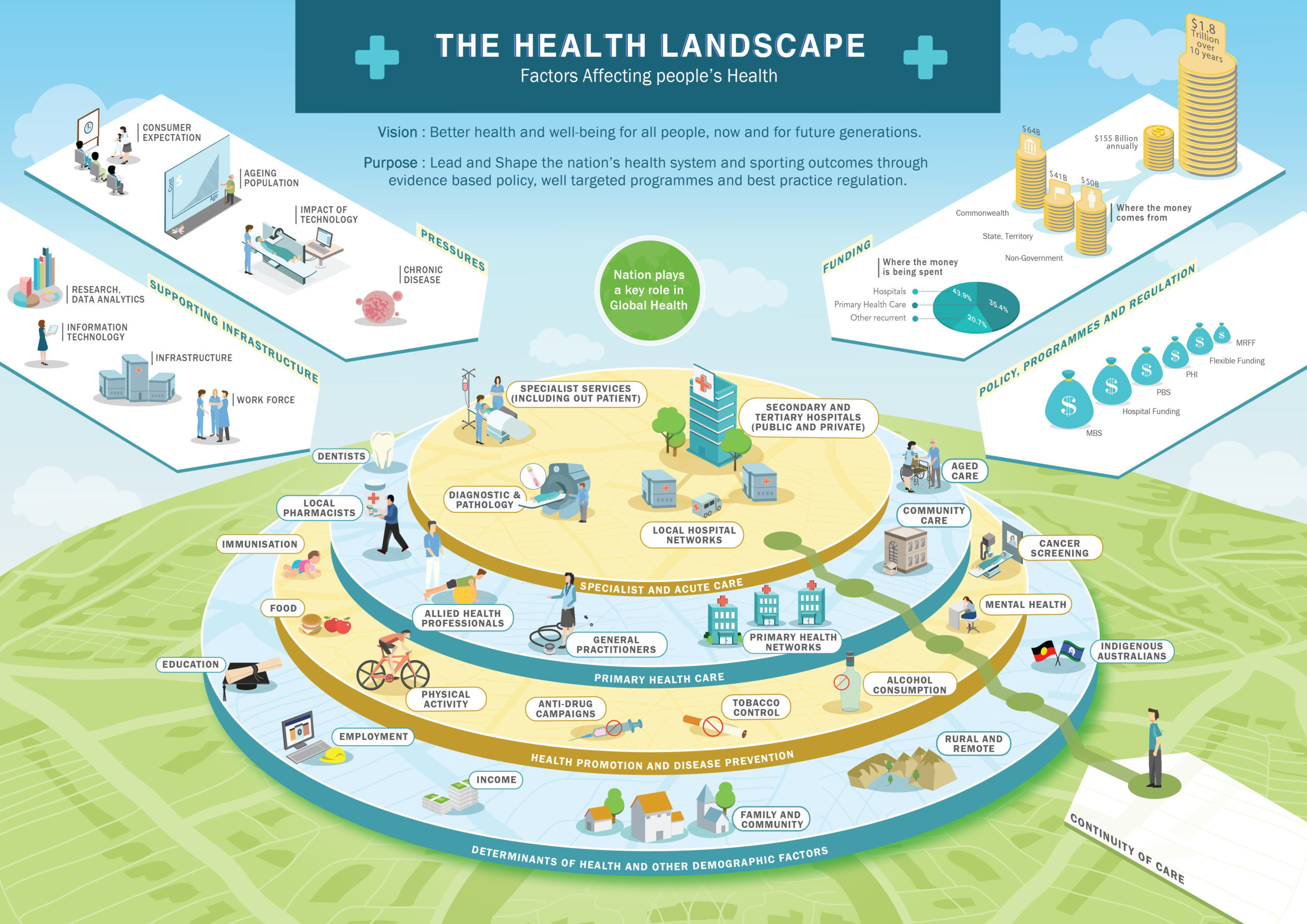
A System Approach for Policy Formulation
Infographic for health care Policy Management.
Challenge : The finance branch of the Department of Health, Australia spends close to $140 Bn in a year. Due to overlaps in policies and inefficient planning, the budgets were in disarray. This led them to realize, the need to educate various teams within the department about the current state of health landscape and the negative impact of siloed-policy-making.
Approach : In phase 1 we distilled the information at a higher level to understand the basic sectors and its financial sources within the health landscape. An infographic was developed to show the copious amount of data in a streamlined manner. This helped all the key stakeholders to realize the interdependencies of various policies on the landscape, the need for a change and further look at the problem in detail.
Outcome : The project created a window to enable the organization to break down the siloes, articulate connections and support a collaborative approach towards policy formulation.
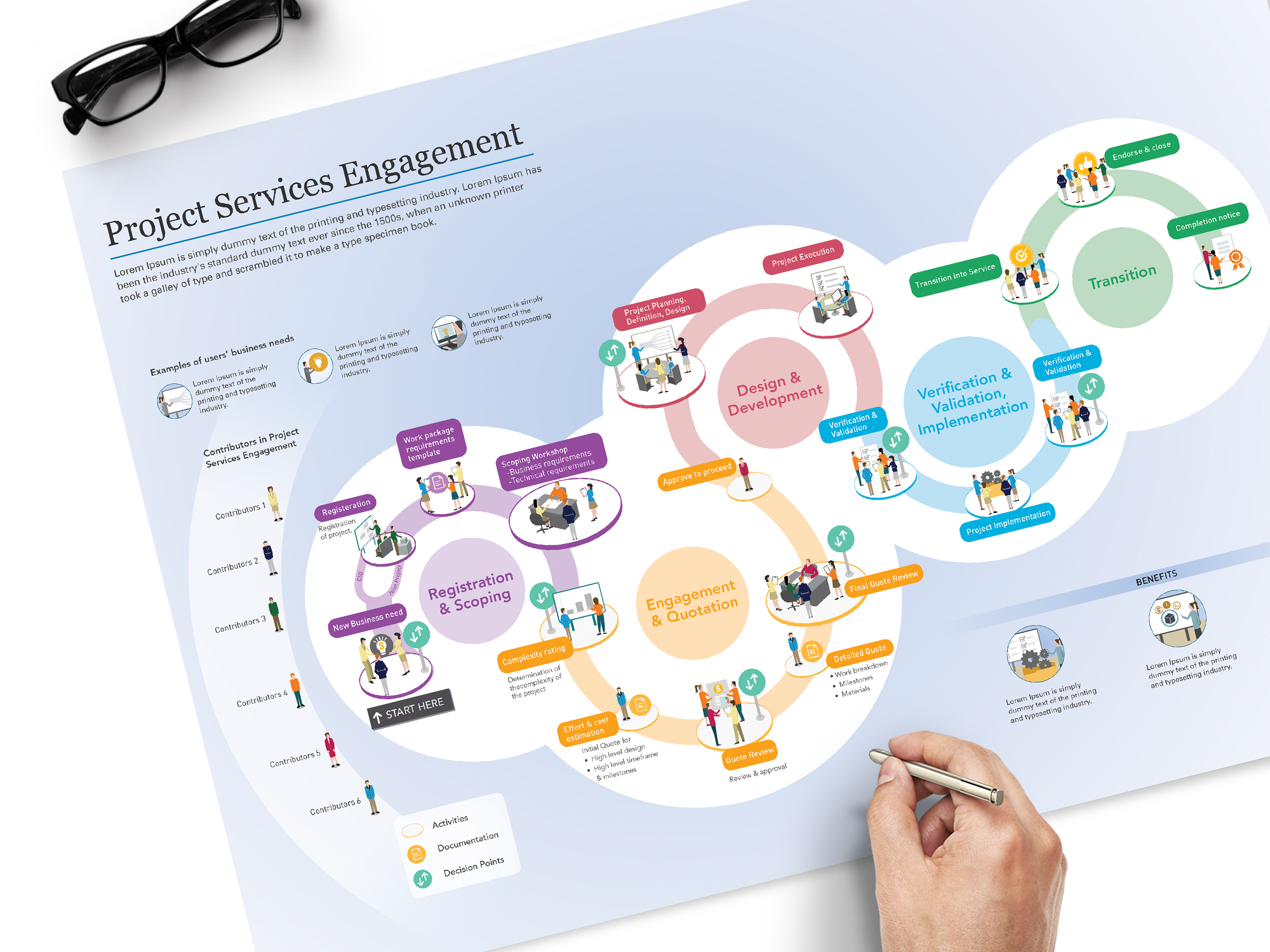
Project Services Process
A process map for Lokheed Martin
Challenge : The audience did not understand what Project Services Process is and why it has been implemented. They felt it is complicated, time-consuming and expensive compared to what was in place. The audience comprehends it to be not agile and responsive to their needs. The client wanted their audience to be confident in the new Project Services Process and when implemented, how it could manage risks and resources. The process would also inform of the audience's role and how they would support the process.
Outcome : A visual process map that clearly communicated the environment, plans and journey for a smooth transition. The engaging infographic was crafted to clearly communicate the roles and responsibilities of various stakeholders such as senior executives, application managers, developers, testers, vendors and end-users across the enterprise which communicated well : The inputs and outputs at each stage of the process, key activites,
The duration of each activity in the process, participants, The sign-off or decision points and the benefits of the process
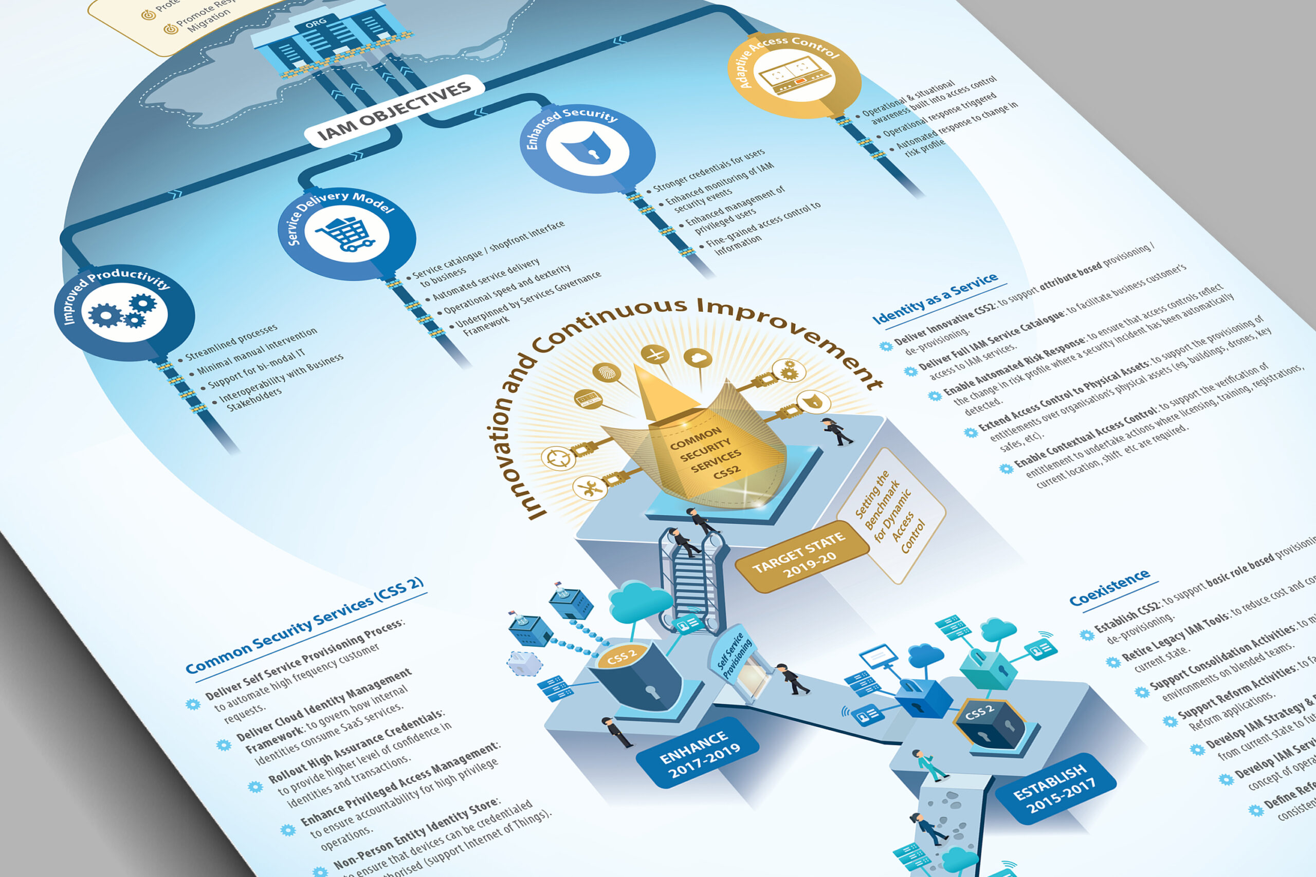
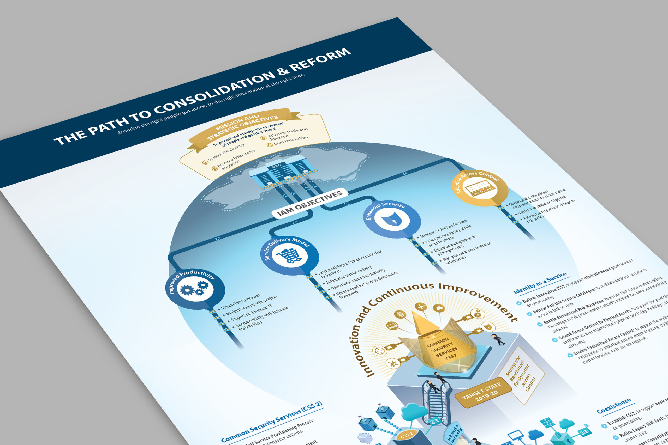
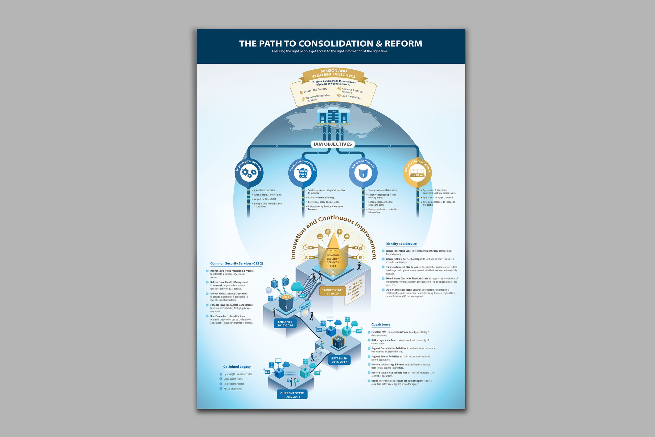
Bridging The Expectation Gap Between Technology and Business Stakeholder
Bridging The Expectation Gap Between Technology and Business Stakeholder
Challenge : The Identity and Access Management (IAM) team within a large government regulation agency, which was at the helm of a massive transformation program, was struggling to bridge the communication gap between the business team’s expectations and the technology team’s transformation delivery plans. The challenge was to understand the organization and the process in detail to decide on the right medium and how it should be done.
Approach : A transformation journey map was created to clearly communicate the stages and steps involved in reaching the end goal that could be easily interpreted by both business and technology teams.
Outcome : This visual road map enhanced team collaboration. Related business areas were also able to benefit from this visualization, using it as a reference for planning activities specific to the transformation program.
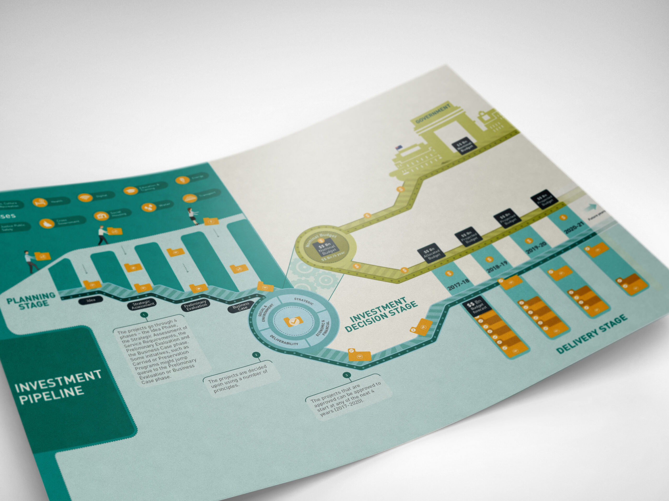
Investment pipeline
One of the investment management team that manages the investment plan across different Government sectors was struggling to explain how there is a logical reason behind decisions taken towards the prioritization of the projects.
The team approached us to provide support to better communicate their process to educate people about the system. We developed a process map to clearly communicate the stages and steps involved in prioritizing the projects. The project led to distilling the current process, bridging the gap between different stages and clarifying how the process should progress.
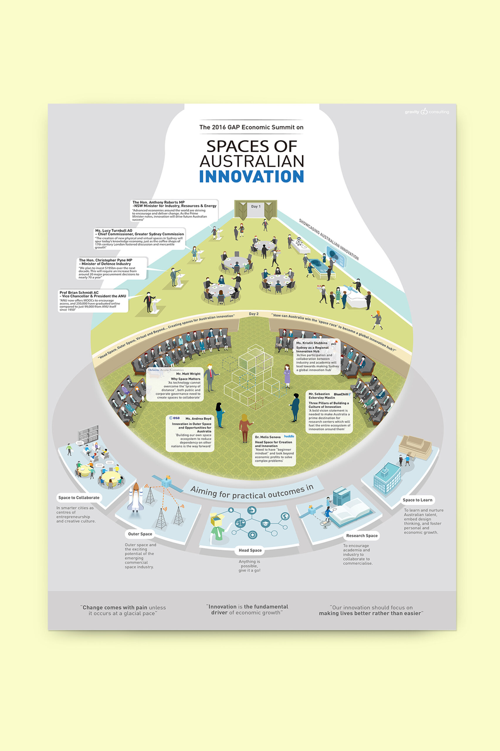
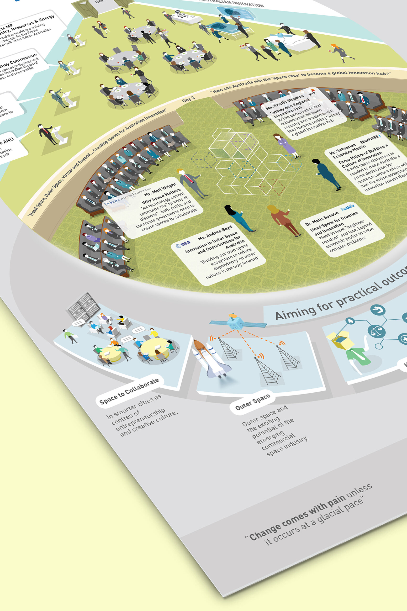
A visual narrative of 2016 GAP Summit
A playback on the Global summit, showcasing what the participants experienced and gained from the conference. Findings from the entire conference were put together and further segregated to identify the key messages that would guide the visual narrative.
An infographic that evoked an emotional response with the actual space for those who attended as well as missed the event.